Cursive Alphabet A to Z: Uppercase and Lowercase Letters with Examples
Compare capital and small letters in an accessible A–Z chart, then turn the alphabet into useful practice.
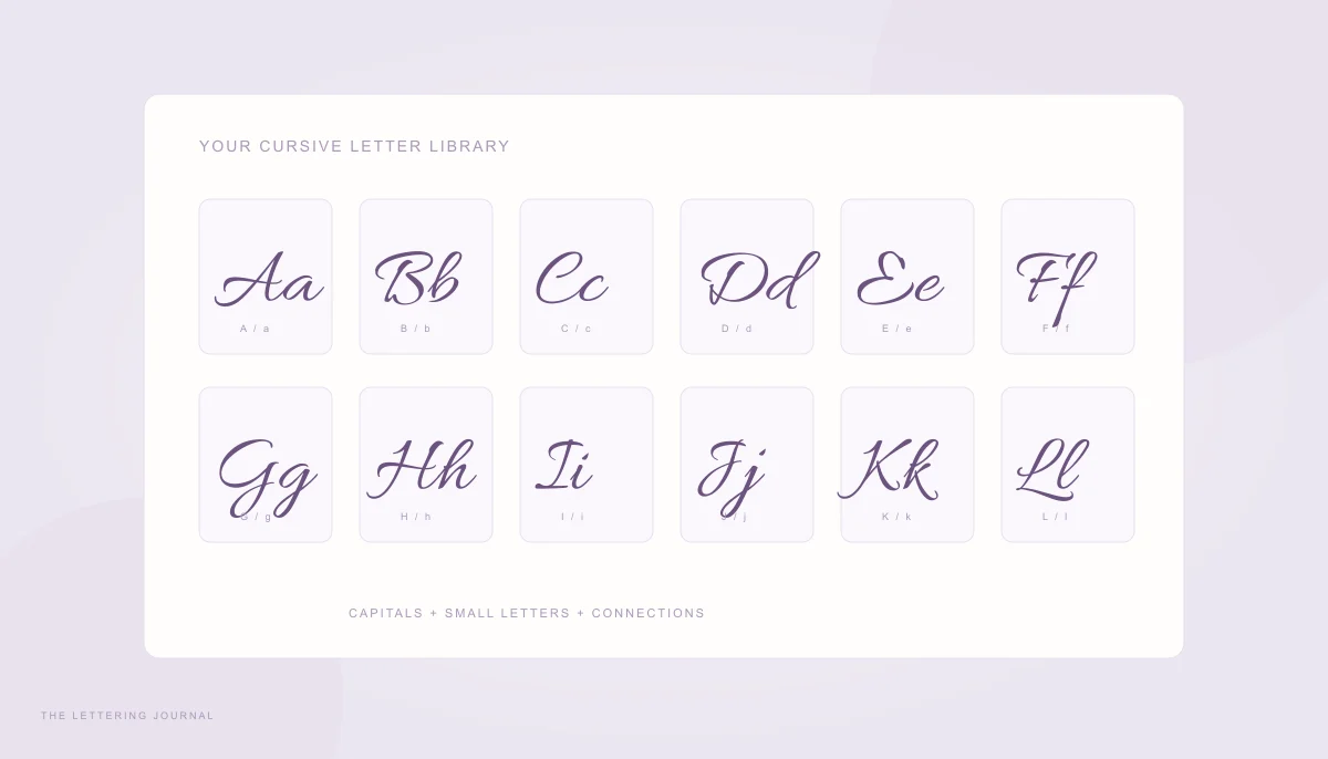
A cursive alphabet is most useful when it helps you recognize letters, understand their proportions, and move into real words. Memorizing twenty-six decorative shapes is only part of the task. Capitals and small letters often use different movements, and a letter may change slightly when it connects to a neighbor. Start with a consistent model, then compare complete words rather than collecting unrelated letter styles.
The chart in this guide uses Allura, one of the locally hosted fonts in the cursive generator. It is an accessible visual reference for digital lettering, not a universal school handwriting standard. Each cell includes the ordinary letter names so you can identify the forms even when a decorative capital looks unfamiliar.
Cursive Capital Letters A to Z & Uppercase Cursive Alphabet
Capital cursive letters A to Z can be looped, simplified, or ornamental. A formal script capital may occupy more width than its printed counterpart and extend above or below the usual writing line. A practical classroom model may keep the same letter compact. Neither appearance tells you the stroke order by itself; learn that from the handwriting system you are following.
Use the uppercase cursive alphabet to compare height, direction, and open spaces. Look especially closely at capitals such as G, I, J, and Q, which can differ substantially between styles. A beautiful initial still needs to be recognizable to someone who does not already know the name it represents.
How to Write Capital Cursive Letters
Choose a single capital and trace its broad movement in the air before putting pen to paper. Identify the main stem, curved bowl, and any return stroke. Write it large enough to see the spaces clearly. Then reduce it to your normal writing size, checking whether the essential structure survives. Do not begin by adding extra loops around an uncertain core shape.
Capital A often combines a sweeping entry with a tall slanted structure, while a script C may be a generous open curve. Capital L commonly uses a tall curved stem and a broad lower finish. These descriptions explain recognizable features, not a prescription for every alphabet. Some models use different starting points, so keep your examples internally consistent.
Place a lowercase letter beside the capital to test proportion. A capital can be taller without becoming so wide that it overwhelms the word. Write Aa, Ll, and Mm with a visible baseline. If the capital is meant to connect, check where its exit meets the next letter. If your model leaves it separate, preserve a small intentional gap.
A digital font cannot reveal where the pen lifted or how pressure changed. Its smooth curves may also include typographic corrections that are difficult to reproduce by hand. For a pen-based introduction, use the beginner practice guide. For invitations and labels, the font chart is useful because it shows exactly which letterforms an image export will use.
Uppercase Cursive Letters with Examples
Compare capitals in names rather than relying only on isolated samples. Amelia tests a strong opening A followed by several small letters. Lily makes the difference between capital L and lowercase l easy to see. Oliver asks whether the opening O is clear beside an ascending l. These short tests reveal proportion problems that a standalone capital can hide.
For initials, try AR, OJ, and LM. Read them at the size where the finished design will appear. A large swash may cross the next initial and create an unintended shape. Increasing spacing can help a pair of separate capitals, but spacing every letter widely may break the intended connections in a fully joined script. Treat initials and normal words as different layout problems.
The displayed cursive writing alphabet includes every ordinary Latin capital and small letter. Its visible glyphs belong to one font, while the plain labels preserve letter identity. A different font may make a recognizable uppercase form look quite different. Use the style comparison guide if you want to understand why formal calligraphy and casual cursive do not share a single alphabet shape.
When you compare capital and small cursive letters, keep the sample size fixed. Enlarging a delicate font until it looks bold can make the comparison misleading. Instead, read the letters in their intended context: a first name on a card, a title on a journal, or a small initial on a gift label.
Lowercase Cursive Alphabet & Cursive Letters Copy and Paste
The lowercase cursive alphabet supplies most of the motion in everyday joined writing. Small letters repeat ovals, loops, arches, and undercurves, with taller ascenders and lower descenders providing contrast. A cursive letter chart is a map of these features. It becomes a practice tool when you select a small group and write connections that use the same movements.
Small Cursive Letters A to Z
Study a, c, d, g, o, and q together to compare their oval structures. An open c should remain visibly open, while a should close before its final downstroke. The descender in g or q needs room below the baseline. If these letters all become narrow loops, slow down and restore the space inside the oval before trying longer words.
Next compare i, u, w, n, and m. Their repeated small movements can look similar in a poorly spaced word, so maintain clear beginnings and endings. Write in, minimum, and window slowly, checking the number of humps. Dot the i after the word body is complete. A consistent small-letter height gives these repetitive forms a useful visual rhythm.
Tall letters such as l and h should visibly rise above the small-letter guide. Letters with descenders, including j and y in many styles, need a separate lower zone. Write little, hello, and joy on lined paper to compare all three height zones. Avoid making every letter equally tall simply because the digital font sample looks dramatic.
The cursive abc is not just a row to memorize. Pick one pair that causes trouble, such as ol or an, and practice it inside a short word. Our cursive L lesson gives a detailed example of a tall loop and its connections. A few carefully compared attempts are more useful than a full page of identical mistakes.
Printable Cursive Alphabet Chart
You can print this article’s alphabet chart from your browser. The print layout removes navigation and related cards, leaving the article and letter reference. Select a sensible page scale in the print dialog and check the preview before printing. The chart remains a font-based reference; add your own baseline guides if your handwriting exercise requires a specific school ruling.
For a custom practice heading, type the alphabet or a shorter letter group into the generator and download PNG or SVG. The input allows fifty characters per line, so separate the uppercase and lowercase sequences onto different lines. SVG stores outlines and stays sharp when enlarged. PNG is convenient in a document, provided you choose enough resolution for the intended print size.
Cursive letters copy and paste are a separate feature. The text mode maps ordinary Latin letters to Unicode mathematical script symbols, with the legacy symbols needed to complete the script alphabet. That preserves selectable characters, but it does not copy the appearance of Allura or any other image font. Digits, punctuation, accents, and unsupported letters remain unchanged rather than receiving invented replacements.
Keep a plain-text alphabet beside decorative Unicode examples when accessibility matters. Screen readers, search, and app filters may treat mathematical letters differently from ordinary writing. If exact visual appearance matters, use an image and provide an ordinary-text description alongside it. If learning the physical alphabet is your goal, return to a consistent handwriting model and practice the movements, not just the appearance of the final glyph.
Your words, beautifully yours.
Try a real name or a favorite phrase. Compare fonts, save a design, or copy actual cursive text.
Open the free generator ↗A few more good reads.
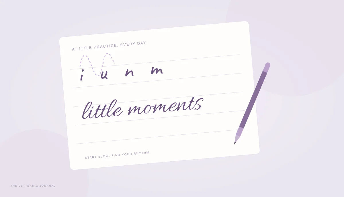
A gentler start to cursive
Learn a comfortable rhythm, useful basic strokes, and simple connections for your first handwritten words.
Read the guide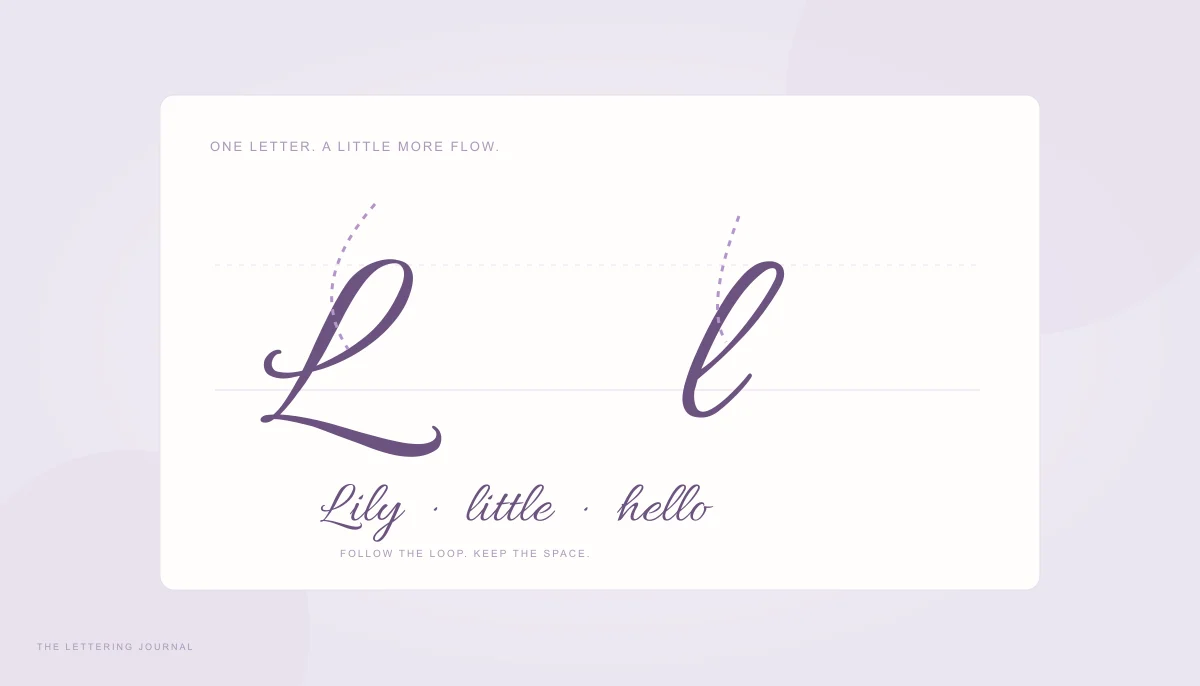
A little love for the letter L
Build a flowing capital and lowercase L with clear stroke directions and everyday connecting words.
Read the guide