How to Write L in Cursive: Capital and Lowercase L Step by Step
Build a flowing capital and lowercase L with clear stroke directions and everyday connecting words.
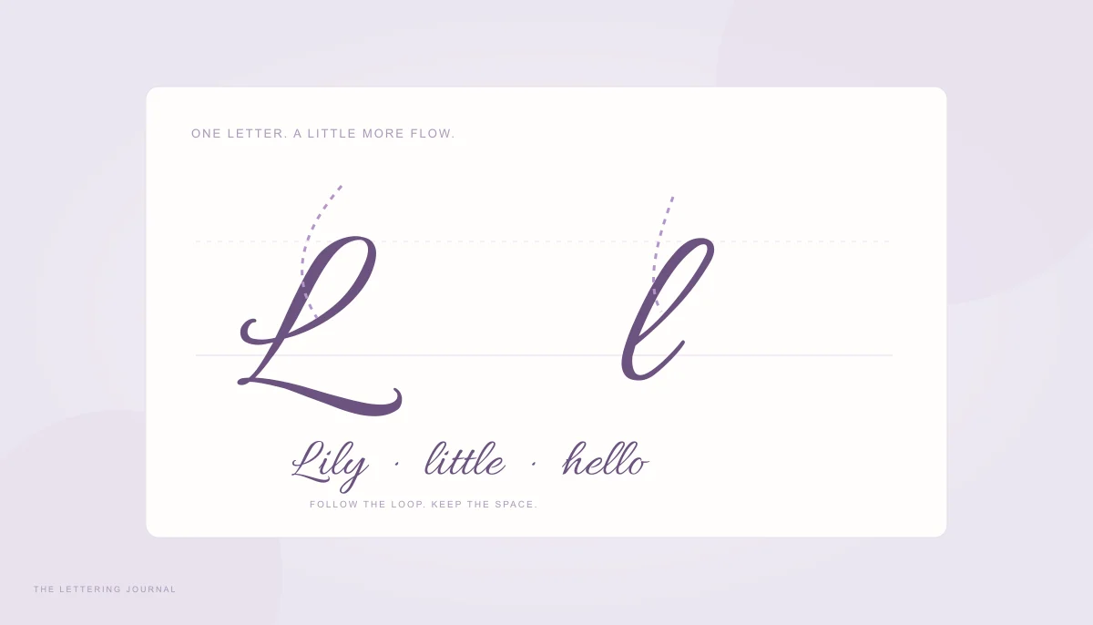
The letter l in cursive is a useful place to practice a tall loop, a smooth return to the baseline, and an easy connection into the next letter. Its capital form often looks quite different from its lowercase form, so learn them as two related exercises rather than stretching the small letter into a large one. A readable L needs a clear shape before it needs extra decoration.
This lesson describes one common looped approach. Handwriting systems and script fonts have alternative L forms, and a teacher’s model should take priority in a classroom exercise. Use the generator with a short L sample to compare finished lettering, then follow a consistent pen model for stroke order.
Capital L in Cursive & Uppercase Cursive L
A capital L in cursive usually combines a tall upper movement with a wider finish near the baseline. The balance between those parts makes the letter recognizable. If the lower sweep becomes too small, the result can look like an isolated loop. If it extends too far, it can crowd the next letter or disguise the beginning of a name.
Before writing, mark a baseline and a capital-height guide. Leave extra space to the right for the lower finish. A pencil is useful for early attempts because you can concentrate on direction without worrying about an uneven ink line. Keep the page at a comfortable angle and avoid bending your wrist sharply to force the loop.
How to Draw Capital L in Cursive
In one simple looped model, begin in the upper half of the writing space, curve upward and left to form a small upper loop, then travel down toward the baseline in a long, slightly slanted stroke. Round the bottom and sweep to the right to create the lower part of L. Finish with a light exit rather than a heavy underline. Use a model sheet to confirm the exact starting point for your chosen style.
Practice the main downstroke and lower sweep without the upper ornament first. The simplified shape should still suggest L. Then add the small loop, keeping it narrower than the broad finish at the bottom. This sequence helps you see which movement supplies the letter’s identity and which movement is decorative. Do not enlarge every loop at once.
Write a capital L beside ordinary printed L and say its name while comparing them. This is helpful when a flowing script shape feels unfamiliar. Follow with La, Le, and Li, checking how the lower sweep leads into each small letter. Some capital models connect naturally; others finish before the lowercase begins. A deliberate pen lift is better than an awkward forced join.
For digital artwork, compare Allura, Sacramento, and Dancing Script using the same sample text. Their uppercase cursive L forms differ in weight, width, and flourish. A font preview shows a finished outline, not the order in which a pen drew it. The alphabet guide puts the L beside other capitals so you can judge the style as a whole.
Common Capital L Writing Mistakes
An oversized upper loop is a common source of confusion. It can draw attention away from the lower structure or resemble another cursive capital. Reduce the loop and write the letter again at a slower pace. Keep its opening visible, and compare the height of the main stroke with the rest of the word instead of judging the loop in isolation.
Another problem is a lower sweep that travels under several following letters. A decorative font may deliberately use that flourish, but a beginner’s everyday capital cursive l does not need it. Shorten the finish until it provides a clean entrance or a clear stopping point. Leave enough room that the next letter does not sit on top of a thick returning stroke.
Watch the baseline. If the long stroke stops above it and the lower curve drops below it, the letter can appear tilted or unstable. Draw a light horizontal guide, let the main curve meet it smoothly, and check where the next lowercase letter begins. Consistency matters more than an exact slant angle, which varies with the model and the writer.
Finally, avoid copying a difficult flourish just because it looks impressive at a large size. Reduce the example to the intended writing size. If the capital loses clarity, simplify the shape. For a name card or heading, a digital font can handle the ornament; for pen practice, start with a letter you can repeat comfortably and recognize without reading the whole word first.
Lowercase L in Cursive & Cursive L Writing Practice
A lowercase l in cursive is tall and comparatively narrow in many looped systems. Its height distinguishes it from a small e, while the open loop distinguishes it from a plain straight stroke. The exact width and entry direction depend on the style. A few clear repetitions help more than a fast row of tightly compressed loops.
How to Connect Lowercase L with Other Letters
Begin near the baseline with a light rising stroke. Travel up and right toward the tall-letter guide, curve over to create the upper loop, then bring the downstroke back to the baseline. Round into an exit stroke for the next letter. In this model, the rising and descending strokes enclose a narrow open space rather than tracing directly over each other.
Try li first. Complete the tall l, let its exit rise only to the small-letter height, and form i without accidentally making it another tall loop. Add the dot after finishing the pair. Then try le: the entrance into e should stay small enough that the two loops remain visibly different. If both letters reach the same height, reset your guides.
For ll, keep the second loop at the same height as the first. The connection between them should not create a third accidental hump. Write ill and all, pausing between attempts to count the actual letter shapes. For ol, remember that the preceding o may exit higher than a baseline letter. Follow the connection used by your handwriting model rather than dragging it downward into an unnecessary loop.
A small cursive l can become too narrow when you squeeze the pen or hurry. Open the loop slightly and relax the turn at the top. If your chosen school model uses an unlooped l, keep that model consistent instead of adding an ornament from a different system. The beginner guide explains how height guides and basic stroke families work together.
Cursive L Words and Practice Examples
Use words that isolate one challenge at a time. Lily contrasts a capital with a lowercase l and a descending y. Little repeats the tall letter and introduces a crossed t. Hello places two tall loops after a rounded opening. Lane gives the capital a simpler continuation. Write each word on its own line before combining them into a sentence.
A useful short exercise is “Lily likes little labels.” Write it once slowly, circle the clearest l, and identify what makes it readable. On the next line, focus on keeping that height and loop width consistent. Do not try to correct slant, spacing, pressure, and every other letter at the same time. One adjustment is easier to repeat consciously.
For digital cursive l writing practice, create a sample containing L, l, and a word such as Lily on separate lines. Increase line height so the upper loops and lower descenders do not compete for space. Export the image if you want a visual reference beside your notebook. It will show the font’s outline; it will not mark pen lifts or movement direction.
When you can write the letter comfortably, try it in a meaningful name or phrase. Our name-lettering guide explains how to compare initials with full names. Keep the recognizable L as your starting point, and add only the amount of flourish that your project, writing size, and personal rhythm can support.
Your words, beautifully yours.
Try a real name or a favorite phrase. Compare fonts, save a design, or copy actual cursive text.
Open the free generator ↗A few more good reads.
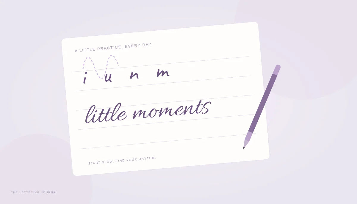
A gentler start to cursive
Learn a comfortable rhythm, useful basic strokes, and simple connections for your first handwritten words.
Read the guide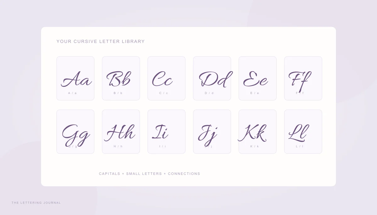
Every letter, beautifully connected
Compare capital and small letters in an accessible A–Z chart, then turn the alphabet into useful practice.
Read the guide