Best Cursive Tattoo Fonts for Names: Beautiful Script Lettering Ideas
Explore script styles at real size and prepare a clear lettering reference to discuss with your artist.
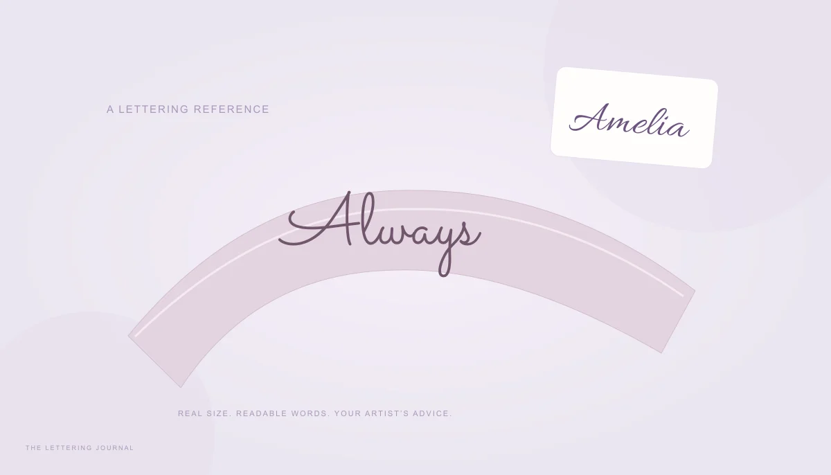
The best cursive tattoo fonts for names are the ones that keep the correct name readable at the intended size and give your tattoo artist a useful starting reference. A dramatic flourish on a large screen is not enough. Letter spacing, open counters, placement, and the artist’s final drawing matter more than a category label or a font’s popularity.
Use the lettering generator to compare several directions, then take the alternatives to your artist. The tool produces digital artwork and does not predict how a design will behave on skin. Treat every preview as a reference for discussion, with the final scale, construction, and placement decided in a professional consultation.
Cursive Tattoo Fonts for Names & Elegant Tattoo Lettering
Cursive tattoo fonts for names can be soft and connected, deliberately calligraphic, or heavier and more angular. Elegant tattoo lettering does not have to be extremely thin. A restrained shape with clear internal spaces can feel refined while remaining easier to read than a tightly packed line of ornaments. Begin with the name itself and choose the style around its actual letters.
Type the exact spelling, including accents and punctuation. A missing character is not a small cosmetic detail in a permanent name design. The generator warns when an image font lacks a glyph and blocks incomplete exports. Choose a supporting family rather than replacing a meaningful letter with a vaguely similar decorative symbol.
Small Cursive Name Tattoo Fonts
Start by defining the approximate physical space with your artist. A wrist reference, a forearm reference, and a larger shoulder composition have different proportions. The generator’s pixel size is useful for making digital art, but it is not a promise about millimeters on skin. Print or place the design in a layout with a known physical size before comparing options.
Look at the spaces inside a, e, o, and repeated loops. If those spaces already look closed in the reference, increasing an outline or shrinking the name further is unlikely to improve clarity. Try a more open family or a larger composition. Avoid deciding that a smaller design is automatically more delicate or more suitable for every placement.
For a short name such as Lily, compare the height of the capital with the repeated tall letters. For Amelia Rose, examine the transition between words and the width of the capitals. A font that fits the first name may become cramped when the surname is included. Test the full version and a deliberate initials option rather than compressing the letters until they barely separate.
Bring more than one reference to the consultation. A simpler script, a stronger script, and a restrained blackletter option can help explain which features you like. The artist can then redraw or adapt the idea for the actual context. The reference should help communication rather than require the artist to reproduce every typographic detail unchanged.
Beautiful Handwriting Tattoo Font Styles
Handwritten tattoo fonts cover a wide range of moods. Allura can provide a light, flowing direction; Caveat suggests a more informal note; Berkshire Swash adds rounded decorative character. These are visual comparisons from the bundled font collection, not claims that one family is universally suitable for a tattoo. The complete name and intended scale decide what remains useful.
A personally meaningful handwritten note is a different source from a digital font. This generator does not reconstruct a loved one’s handwriting or turn a font into evidence of an actual handwritten message. If authenticity matters, discuss a genuine source with your artist and preserve its spelling and character. A font can suggest a mood, but it cannot supply personal provenance.
Use the same phrase and approximate size when comparing families. Otherwise, a larger preview can make a thin style seem clearer than a smaller, heavier one. Keep the background plain during the first comparison so you can inspect letterforms without decorative distractions. Add color only after the structure makes sense.
Compare the name in an ordinary upright view as well as any proposed angle. A highly slanted script combined with a curved placement can change the way readers recognize individual letters. Ask the artist to explain how the reference would be positioned and adapted. Your aim is a readable idea that works in its context, rather than a beautiful isolated word on a screen.
Cursive Script Tattoo Fonts & Calligraphy Tattoo Designs
Cursive script tattoo fonts usually emphasize connections and a smooth rhythm. Calligraphy tattoo designs may add stronger stroke contrast, deliberate spacing, and elaborate capitals. Gothic lettering offers another direction, using a denser, more angular texture. These families overlap, so choose by visible structure rather than assuming that every design in the Tattoo Lettering filter has the same character.
Minimalist Cursive Tattoo Lettering
Minimalist lettering begins by reducing unnecessary elements. Keep the meaningful word, simplify the capital, and remove decorative strokes that compete with recognition. A single name or a short phrase such as “Always with me” may communicate more clearly than a long sentence squeezed into a small space. Shortening the text should preserve its meaning, not remove a crucial name or date.
In the generator, start with zero outline and neutral colors. Examine the basic silhouette before adding effects. Letter spacing can help separate independent capitals, but too much tracking can break connected cursive forms. Move the control gently and check the joins. A typeface designed for connected writing cannot always be spread apart without changing its visual logic.
Try both a full name and initials. Initials reduce the text length, yet they can become ambiguous when capitals overlap. Leave enough separation that each letter remains identifiable. If you choose a date, keep its numerals clear and verify the order and separators. The generator does not check whether a date or spelling is factually correct.
The name-writing guide offers practical comparisons for first names and full names. The cursive versus calligraphy guide explains why different script families feel different. Those comparisons can help you describe a preference to your artist without relying on an imprecise phrase such as “something fancy.”
How to Choose Readable Cursive Tattoo Fonts
Make a shortlist and compare the same text at the same intended dimensions. Ask whether every letter remains recognizable without being told the name first. Check repeated letters, crowded joins, and the spaces between words. If a decorative capital reads as another letter, choose a clearer variation rather than assuming context will always explain it.
Download SVG when the artist’s workflow accepts vector files; this site’s SVG contains shaped outlines and does not require the font to be installed elsewhere. PNG is a convenient reference image. A transparent background can help placement in a mockup, while a solid background can make the lettering easier to review. Neither format replaces the artist’s final stencil or drawing process.
The bundled fonts have individual open-license notices stored with the project. Those licenses concern font software and its permitted use; they do not guarantee trademark clearance, ownership of a phrase, or permission to reproduce someone else’s artwork. If a design includes a protected logo or another person’s work, review that source separately. Use the font reference as one part of an original, considered design.
Before proceeding, verify the exact name with the person who knows its intended spelling, inspect the chosen reference at real size, and ask your artist about spacing and adaptation. Keep the digital file and the plain-text spelling together. A careful reference is valuable because it makes the conversation precise; it does not remove the need for professional judgment about a permanent piece.
Prepare a dimensioned reference with the Tattoo Lettering Size Calculator. Compare tight and open joins in the Calligraphy Letter Spacing Calculator before reviewing the printed design with your artist.
Your words, beautifully yours.
Try a real name or a favorite phrase. Compare fonts, save a design, or copy actual cursive text.
Open the free generator ↗A few more good reads.
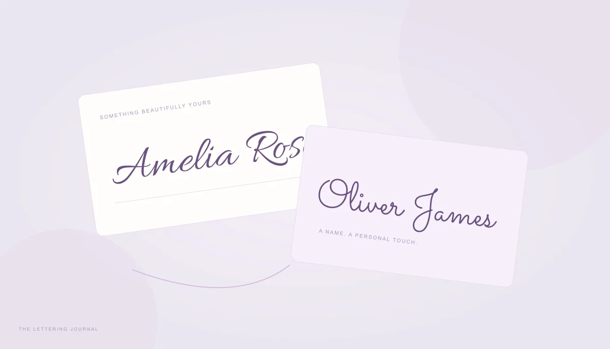
Make your name feel like you
Compare first names, full names, and initials, then choose between image lettering and copyable text.
Read the guide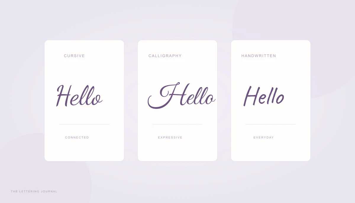
Find the right kind of script
Understand the differences between joined handwriting, expressive calligraphy, and digital script fonts.
Read the guide